Client
Emblema
Sector
clothing design
Discipline
Branding and Art direction
Year
2023
Who?
It's a women's clothing market place based in Buenos Aires
What?
We work on a branding that represents the emblematic name, creating the soul of the brand to be able to apply it to your communication, social networks and even to your photographic campaigns.
How?
The Emblema logo is made up of the symbol formed between two Es that are joined through a seam on the back, simulating the scraps of fabric used to create the final pieces, accompanied by thin and thick strokes that end up giving it the necessary elegance that its name requires.


SYMBOL The symbol is the most important identifier of our brand. It is the essence and minimal expression of our visual identity. WORDMARK The wordmark "Emblem" is an identifier, our main concept and the purpose of the brand that fulfills the function of signing all our communications accompanying the symbol. COMPLETE LOGO Denotes the entire fundamental hierarchy of elements.
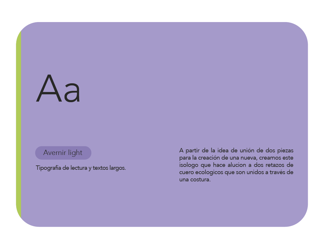
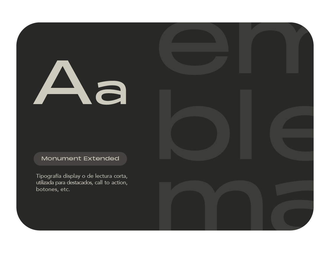
TYPOGRAPHICAL USES To maintain clarity, consistency and recognition in our messages, we use a typography with a lot of character and fully connected with our visual language. The fonts of our brand will be the main ones for our communication, but new families may be added as an accompaniment depending on what they want to communicate.
.
